How we designed the Pixel Fold, Pixel Tablet and Pixel 7a
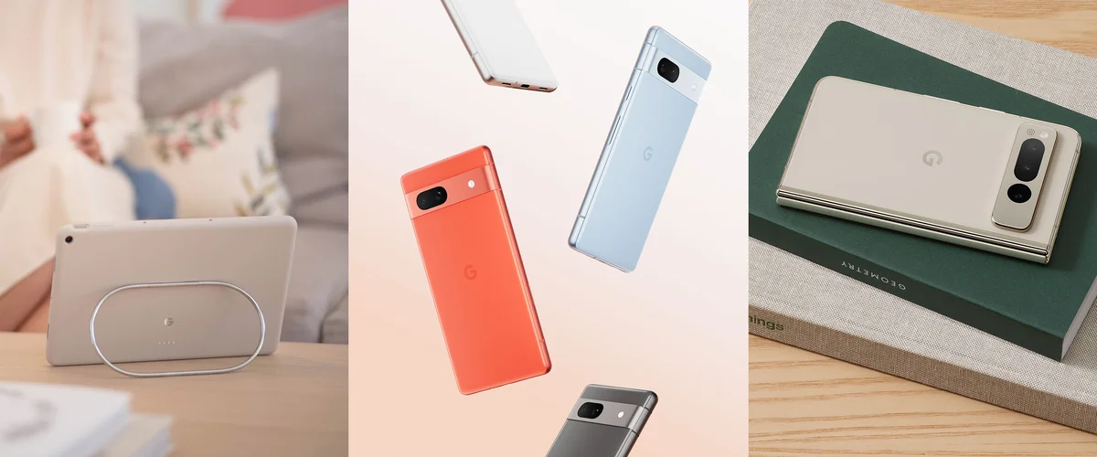
Today at I/O we announced our newest Pixel products: the Pixel Fold, Pixel Tablet and Pixel 7a. Our latest lineup builds on what you might already expect from Pixel while reinventing what our hardware looks — and feels — like. “One of our guiding concepts for these launches was to enable people to do more with less,” says Ivy Ross, head of Google hardware design. “Technology shouldn’t be single-use — we wanted these devices to be multifunctional.”
For years, a team of Googlers has worked to finetune the look, substance and feel of these newest products. That team includes Ivy as well as Claude Zellweger, who leads Industrial Design for mobile, and Isabelle Olsson, who leads Industrial Design for a variety of Google devices as well as color, materials and finish (CMF) across the portfolio.
“A lot of what we’re doing is inventing new things, and that requires so much collaboration across UX, research, product design and engineering,” Isabelle says. Here’s how that deep collaboration led to our newest Pixel products.
The look
A stroll through the CMF studio in Mountain View reveals dried flowers, pom-poms, paper clips, macaroons, bars of soap and pieces of glass, all grouped together by shades to create a rainbow-like, physical mood board. Designers bring back these bits and pieces whenever they travel, or even just from lunchtime walks, Isabelle says. Many of these items influence their process as they develop a new range of product shades. “For this lineup, we wanted to have dark neutrals, light neutrals, a cool pop and a warm pop,” says Isabelle. To tick those boxes for our latest hardware portfolio, the team landed on the shades Coral, Rose, Sea, Snow, Charcoal, Hazel, Obsidian and Porcelain, with each product coming in some combination of those colors.

The Pixel Buds A-Series and Pixel 7a will come in a new color: Sea.
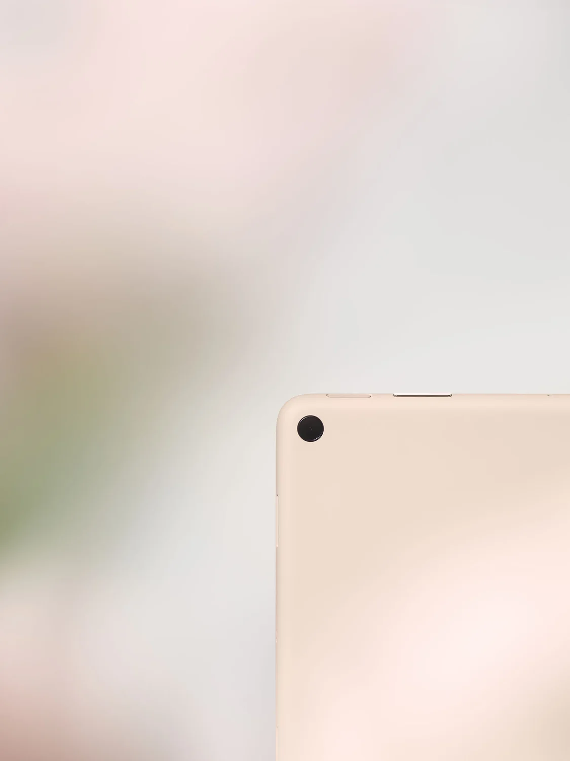
The Pixel Fold will come in Obsidian and Porcelain, for instance. The team chose those colors because they felt that Obsidian’s sophisticated depth and Porcelain’s airy lightness match the feel of the Fold. Creating the Porcelain shade was an especially rewarding process. “When we started developing Porcelain, we wanted to bring in a new kind of neutral that felt warm and comforting, especially with all of the uncertainties in the world,” Isabelle says. Work on Porcelain began during the pandemic, and the team looked at ceramics, sand and cashmere to come up with a color that was just right.
“Seeing the Porcelain color on the Pixel Fold was one of those ‘aha’ moments,” Claude says. “We immediately knew, ‘Oh, that’s it!’” Ivy says of seeing the Fold in Porcelain. “When we get to that space, we just look around and smile at each other.”
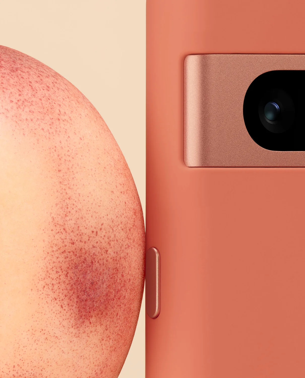
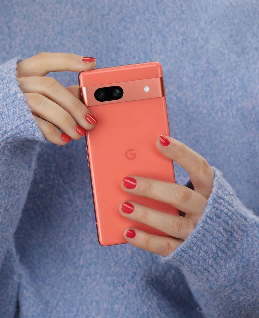
As for the 7a’s light and dark neutrals, you’ve got Snow and Charcoal, while Coral and Sea offer those brighter pops. “Coral is joyful and full of energy. It’s confident,” Isabelle says. “It’s an attention-grabbing color that’s radiant and warm. And Sea has this sort of effervescence — it’s sort of icy, and it’s playful but also elegant.”
The materials
Color isn’t the only thing designers work to get just right — what devices are made of and how they’re built is also incredibly important. For this particular portfolio, the designers focused on “premium” materials — things people would immediately recognize as high quality.
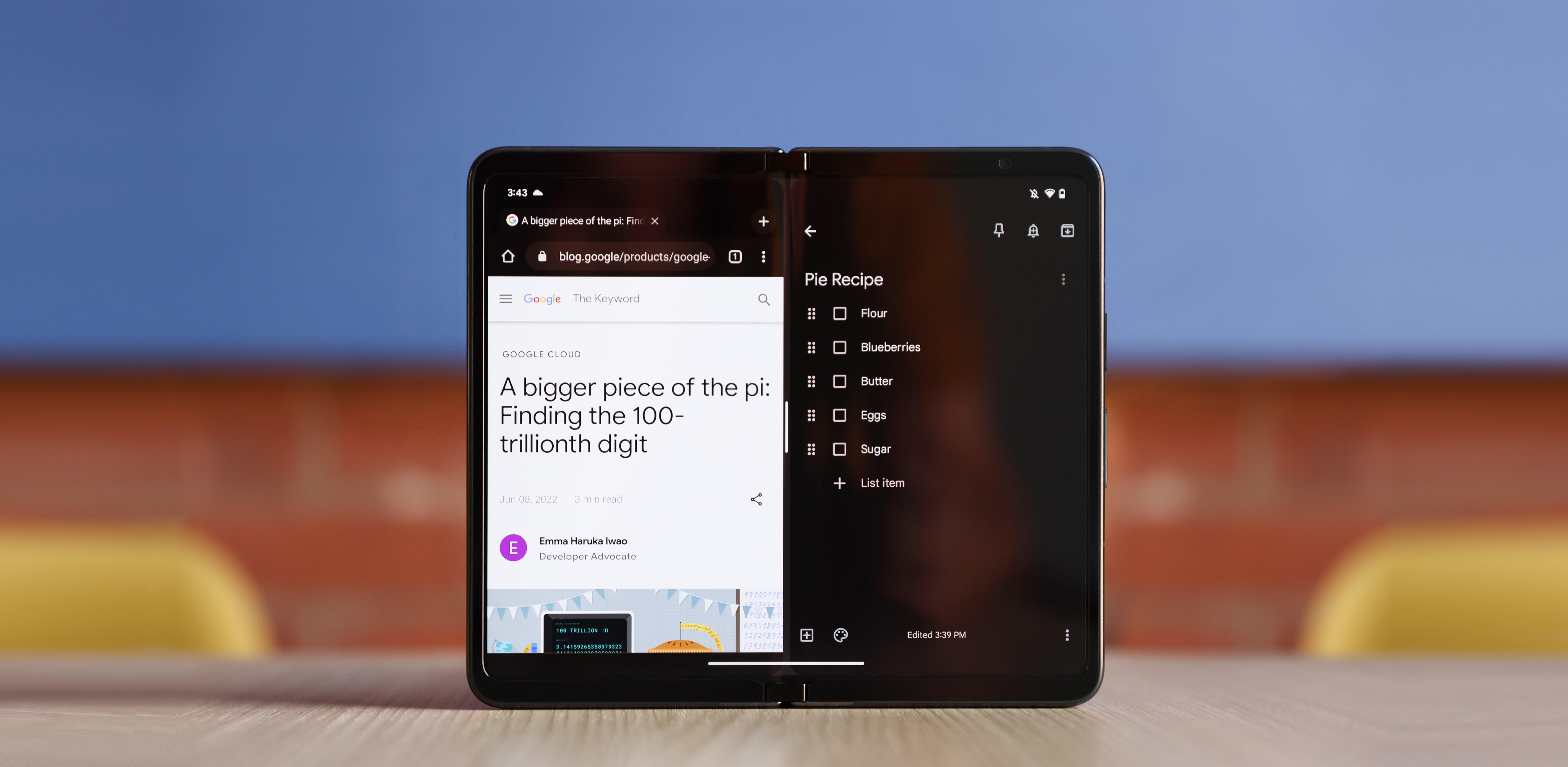
For the Pixel Fold, the team used materials that enabled them to build a thin device that, most importantly, still felt like a phone. “We wanted it to feel familiar at first, and then full of new possibilities when unfolded,” says Claude.
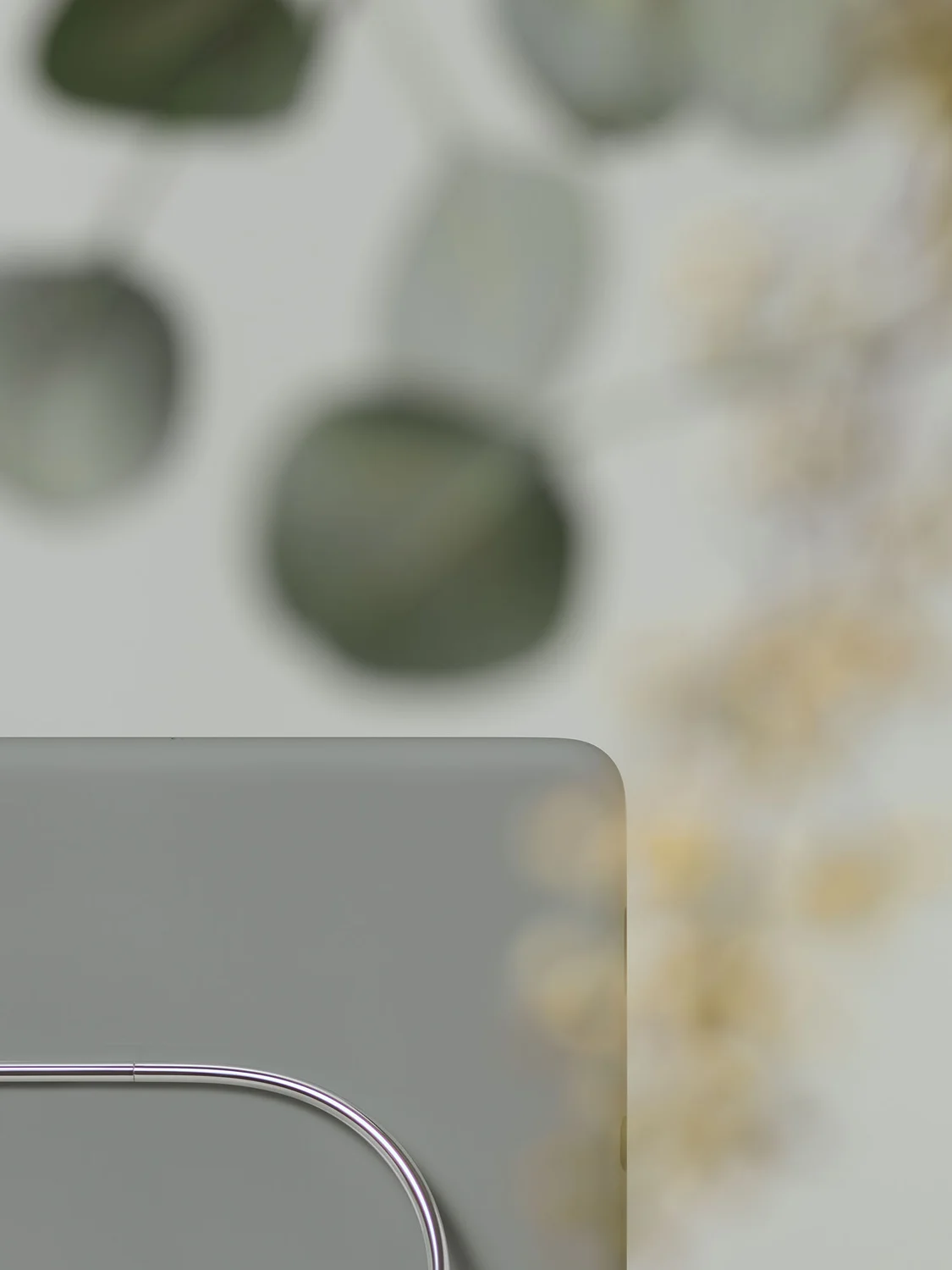
The anchor piece of all this is the Fold’s stainless steel hinge. “The striking polished finish we went with for the hinge just really took it to the next level, it has a luxury feel,” Claude says. “In addition to making it more durable.” Since the hinge will naturally get a lot of use, the team liked that stainless steel would help it avoid wear and tear like scratches, all while keeping its shine. The team wanted to encase the Fold with a sheen of luxury and quality. “You look at the finishes of things you wear often, like your watch or your wedding ring. Your phone is something you carry with you just much, so we wanted them to have that same high-quality look and feel,” Isabelle explains.
The stainless steel hinge is what truly brings the Pixel Fold together.
Another notable material design choice: the Pixel 7a’s zirconia-blasted aluminum housing, the same as the Pixel 7. Zirconia blasting is basically a very delicate form of sanding a metal. This gives it a smooth, sleek surface that’s almost silk-like, Isabelle says. And for sustainability reasons, that aluminum is 100% recycled1, while the resin used for the 7a’s back cover is 67% recycled2.
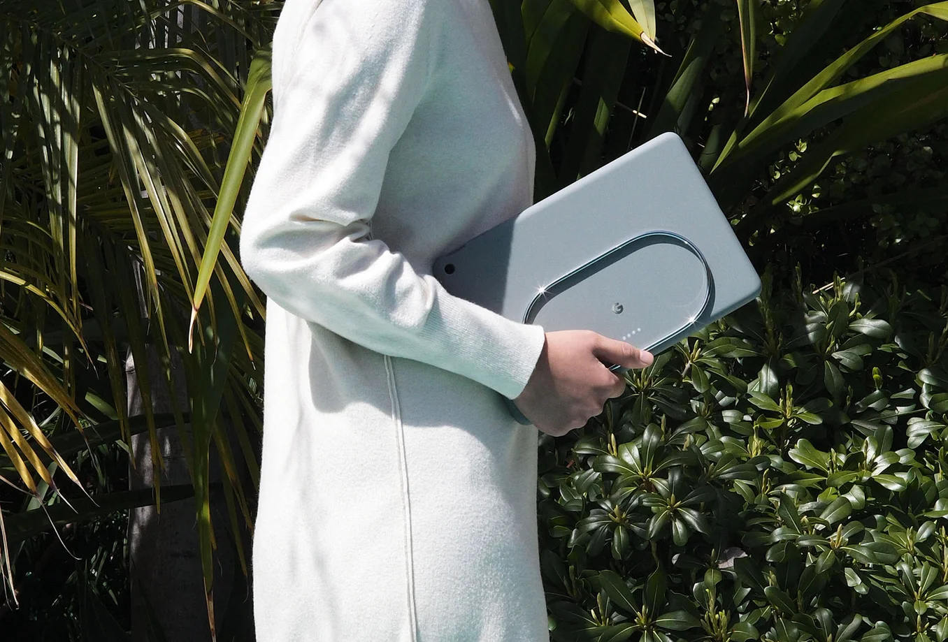
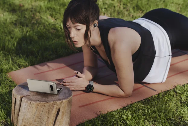
When it came to the new Pixel Tablet’s materials, the team focused on designing a product that people wanted to use and that would fit into their homes. The design process involved user research. “Part of what we need to do as designers is to listen to what people say but also observe what they do,” Isabelle says. In researching, they saw people do things like stick their tablets in drawers instead of keeping them out. So they set out to make a tablet that Isabelle calls “more inviting,” in part by taking cues from natural materials and items that are often found in people’s homes. For example, the designers looked at ceramics again, which led them to develop the tablet’s nano-ceramic coating. Isabelle remembers seeing a little gold earring on a ceramic plate during the research process and thinking “OK, that’s it. We have something here.” That inspiration led to the new coating, which she describes as super soft, but also matte.
The feel
Another crucial piece of hardware design is how something feels, like how satisfying a snap or click is. That came into play when the team designed the Pixel Tablet’s docking station. In their research, they’d seen people not use their tablets often because they weren’t charged. So they aimed to make a more enjoyable charging experience, and also make something that people would want to pick up and use as they moved around their homes. “The amount of experimentation we did on the magnet layout for the Tablet and the docking station to get the right amount of ‘sticking’ was incredible,” Isabelle says. “We actually developed a rubberized textile that creates a dampened feel for the dock, and it has this very satisfying sort of ‘bonk’ sound and feeling when it snaps in. It’s almost like a soft landing, but a very precise feeling.”
Ivy, meanwhile, loved the sensation of taking the tablet off its dock, and watching colleagues enjoy it, too. “It’s magic when you grab that tablet and walk away,” she says. “People told us it felt like the tablet was secure, but also like it was floating off the surface, ready to pick up.”
The Industrial Design team similarly wanted to nail the feel-in-hand experience. "The compact yet rock-solid hinge was engineered to provide a satisfying, almost vacuum-like sensation when the device snaps closed. There’s an element of surprise," Claude says, “It’s delightful.”
That idea of “feel” — physical and otherwise — is something Ivy, Claude and Isabelle all keep coming back to, and something they focused on for years while working on our newest devices. “When we talk about our work, we use the phrase ‘design feeling’ versus ‘design thinking,’” Ivy says. “Because it’s really more about how do you feel when you see an object? And how does it feel when you hold it?” Bottom line: The team hopes that the new Pixel portfolio feels good to users — and maybe most importantly, that they make the people using them feel good.

